
A common frustration and confusion clients have is when their website images don’t appear as they expect. They think the image is too zoomed in, or too cropped or too panoramic feeling. This is because we need to consider how an image behaves with wherever it’s being placed.
For visualization purposes, let’s imagine the image is placed within a box – because indeed it is – whether it’s a slider, or an image grid, or a full width image.
There are three options for your image within that box
Consider the below two examples with the pink image box and observe the image placed within the image box.
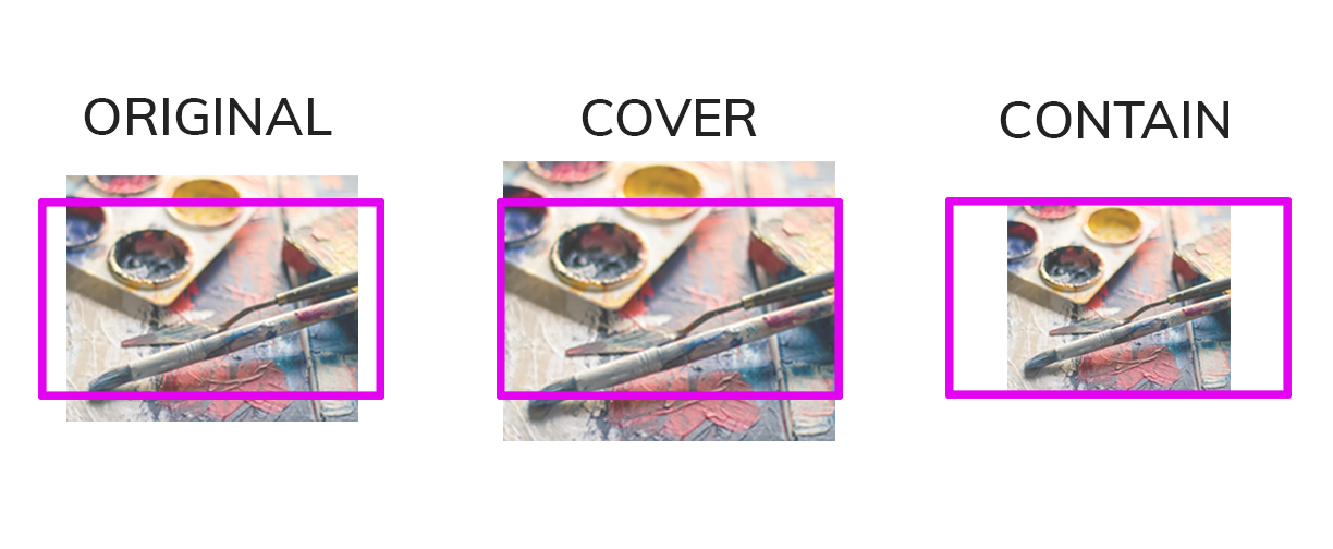
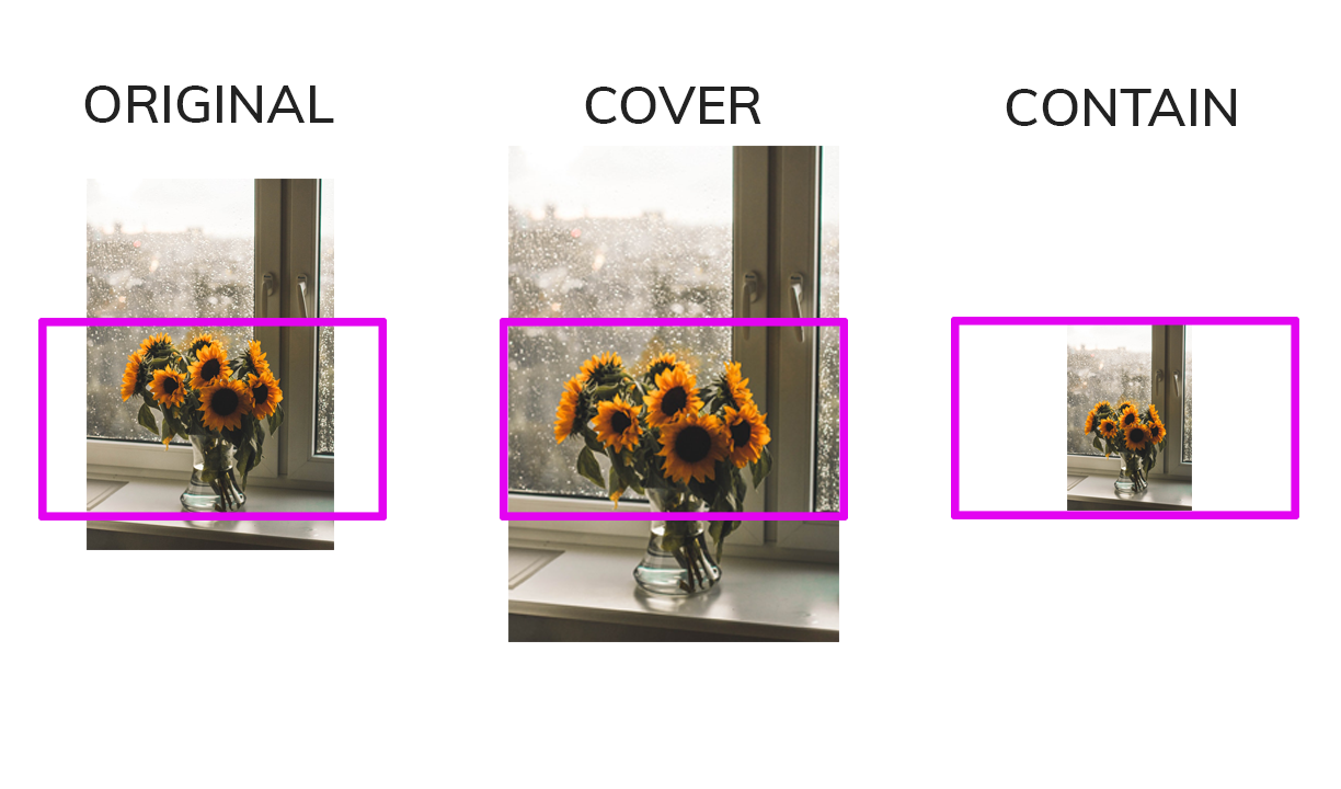
- The image can stay in its original form and be whatever height and width it is originally. As you can see above, this might not always fit the image box well. Look at all that white space on the left and right. The image and the image box would have to be the exact same height and width for it to fit perfectly, which isn’t too realistic especially with responsive design.
- The image can cover the box. This will ensure the image completely covers the image box area. However, as you can see the image needs to get bigger, it needs to zoom in in order to cover the image box. This results in only a portion of your image displaying. Sometimes the image can feel panoramic if the image box is too short in height, or if the image itself is obviously really zoomed in.
- The image can contain itself within the box. The image will fit in the box by matching the image box’s height. With this option you see 100% of the image, but you also aren’t filling the image box completely. This sometimes matters and sometimes doesn’t.
If you are looking to add images to a full-width slider for example, then you want to cover the image box. With that, the above pros and cons will apply. The best solution is to pick images that either are generally around the same height and width (aspect ratio) as the slider image box, or better yet choose images that aren’t compromised with some zooming and cropping.
Images that work well in sliders
- Square, square-ish, or 4:3 aspect ratio.
- Scenery, nature, abstract (less negatively affected by cropping/zooming). Non-busy images.
- Images that sit within a bigger image or background. Think: a white slider with just an iPhone in the center.
Images that do not work well in sliders
- Images with specific/definitive subjects such as people – a zoomed in or cropped person does not work.
- Images with content sensitive to being cropped like showcase or portfolio pieces.
- Long rectangle images – these will need to zoom in so much, that you will only see what feels like a sliver of the image. As shown above with the sunflower.
- Images whose content is important to absorb or read. This is regarding the separate concern of usability and communication; don’t expect your users to obtain important information from a moving object!
These considerations apply to any image whether it’s a slider, grid, slideshow, carousel or full width image. Another huge factor is responsive design and how the image box can potentially change with the screen size.
Visuals are so important to your site. The judgment and use of those visuals is equally important. The reality is: what you want to work might not always translate to web. Don’t force something that isn’t working.
If an image you love isn’t working perfectly on a slider – it’s best to not use it on the slider and find somewhere else to place it. A great impression is more important than a single image.